BowTie++ in Action
Methodology & Tool for risk assessment
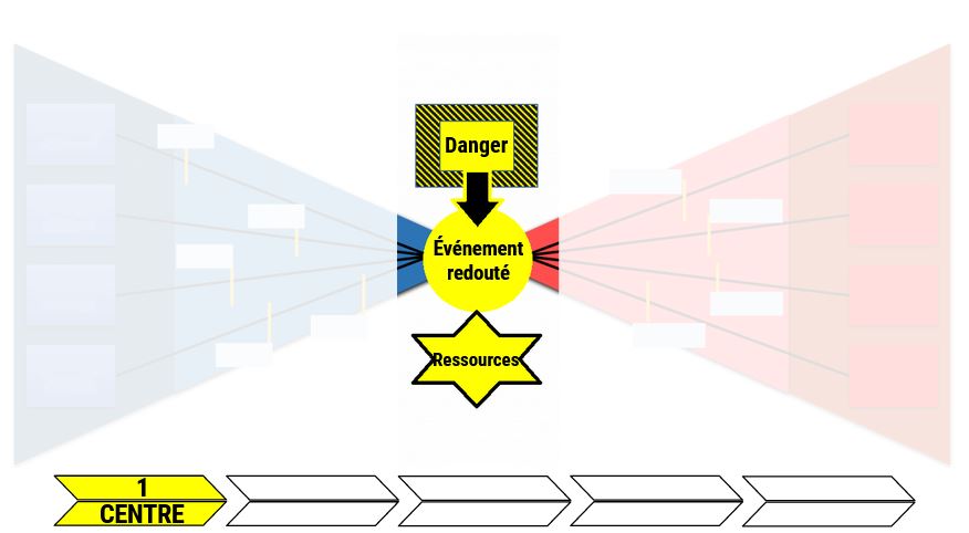
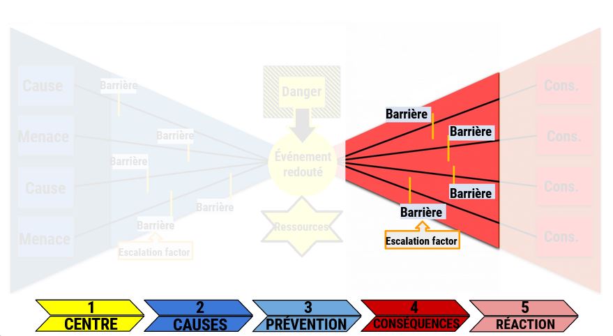
BowTie++ is an open-source web application that allows users to create personalized diagrams according to the Bowtie method. Bowtie diagrams are used to carry out risk analyses and evaluate the level of danger related to a certain unwanted event. During this year, our project aims at improving the Bowtie methodology and putting the tool into practice in order to confirm its efficiency for industrial use.
Project's objectives
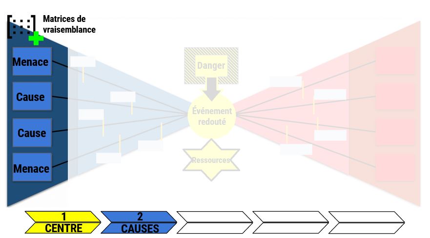
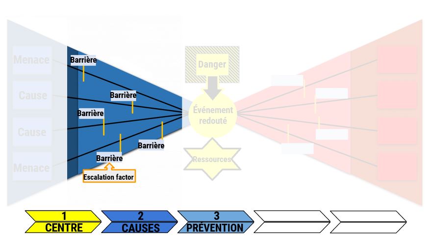
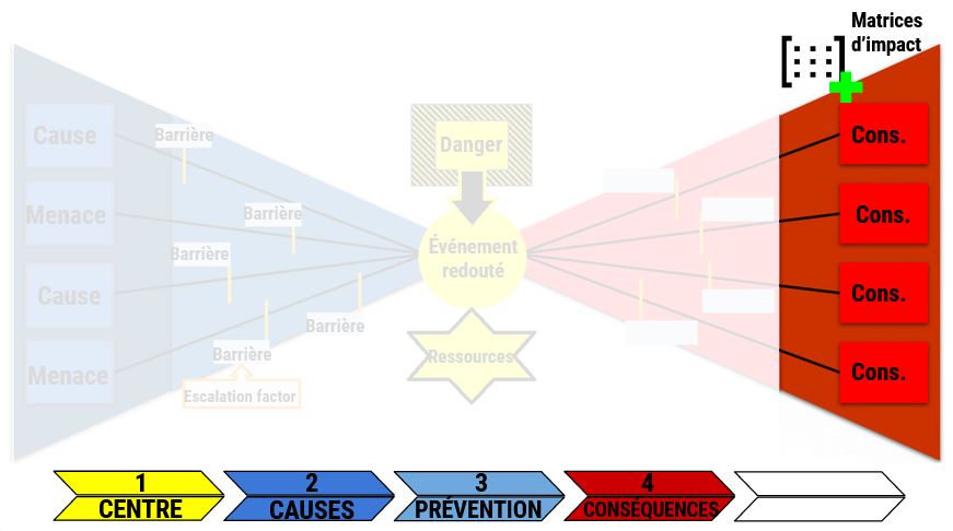
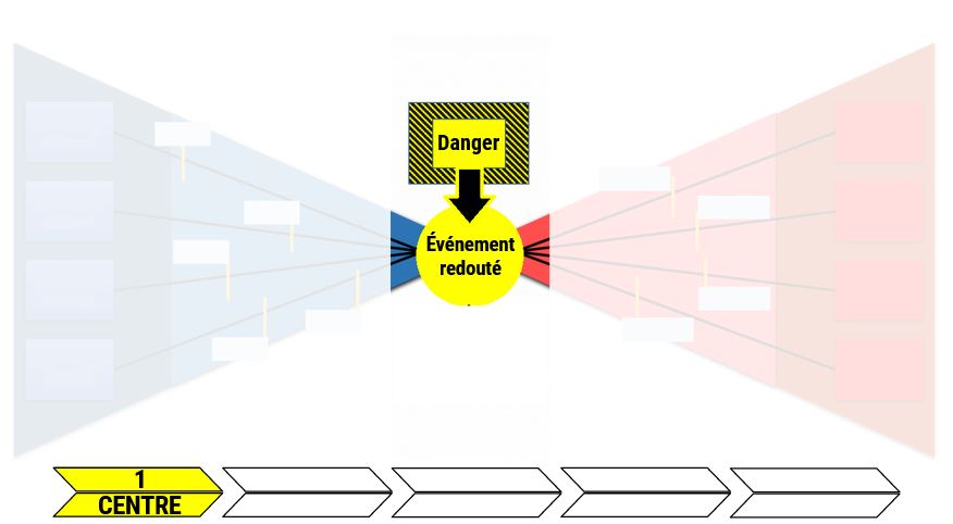
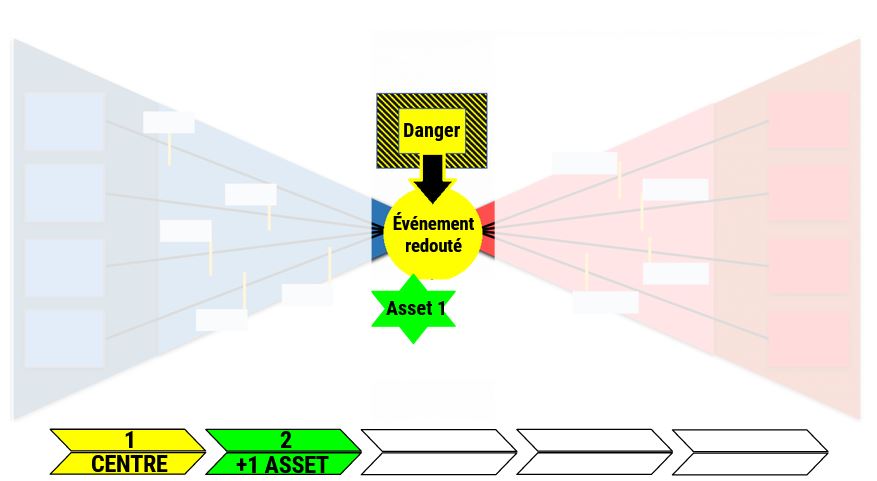
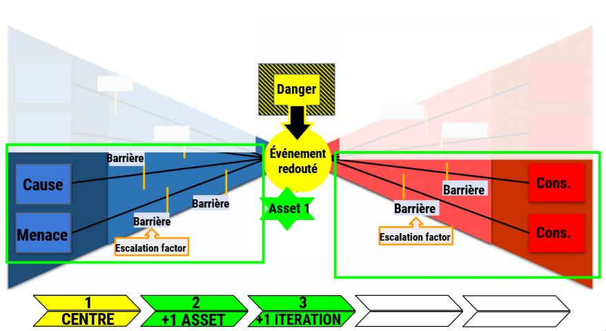
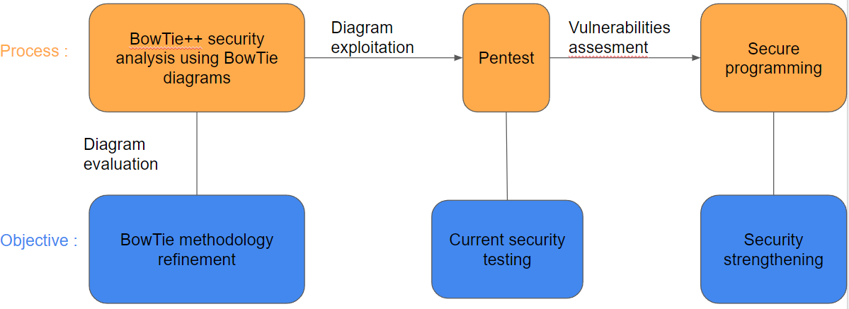
Our project consists of two main directions: research and software development. Indeed, our objective is to establish a risk analysis methodology using Bowtie diagrams. This methodology must be simple and effective to allow any user, expert or not, to easily reason about potential risks. The methodology has been tested and improved through numerous case studies in various fields, then evaluated using specific criteria and indicators. The processing pipeline is shown below.
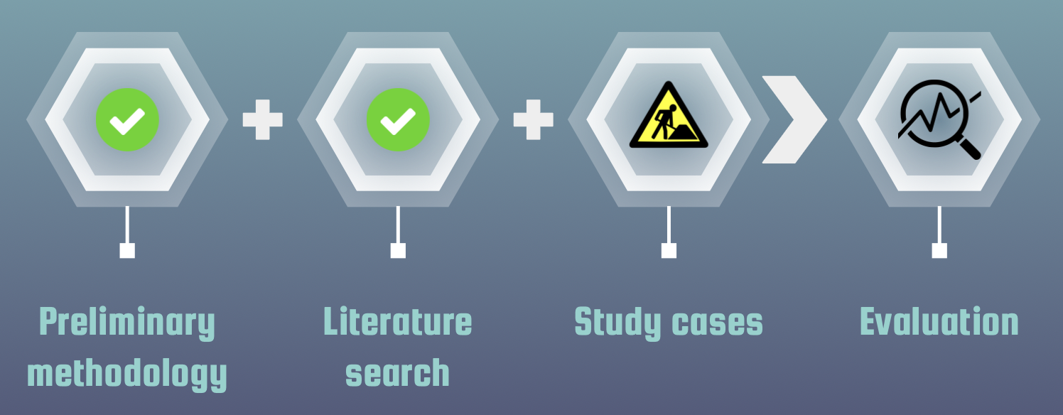
At the same time, we must ensure that the methodology can be used with the BowTie++ tool. We are therefore working to improve the user experience and add features to the application. Finally, a systematic vulnerability search in Bowtie++ is performed to guarantee the security of our solution.
Methodology
Design Patterns
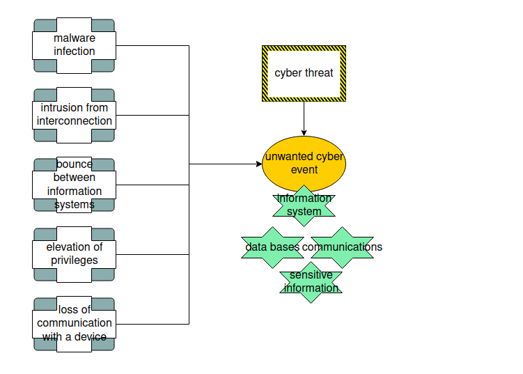
Diagram evaluation
User tutorial
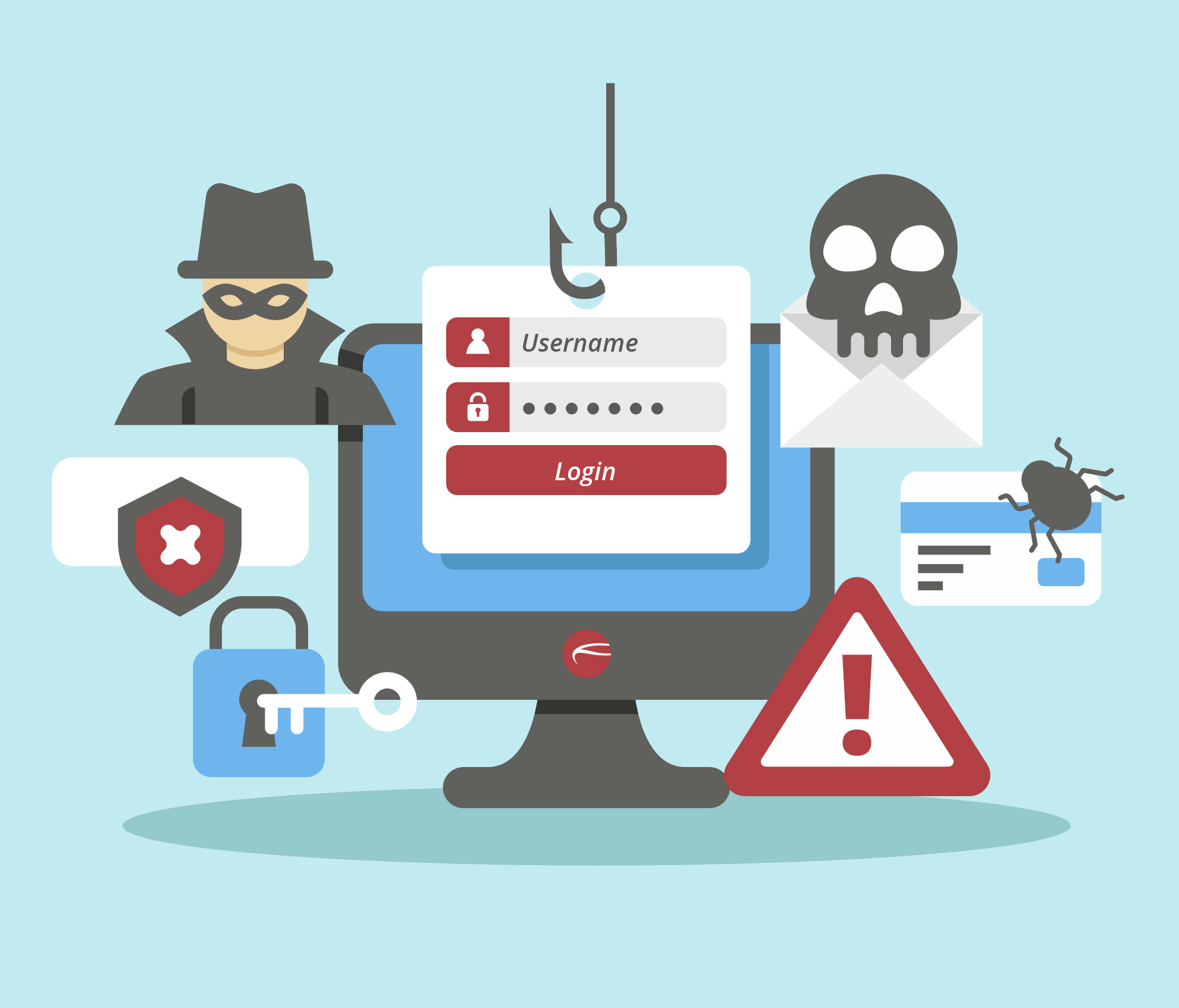
Security
User memo
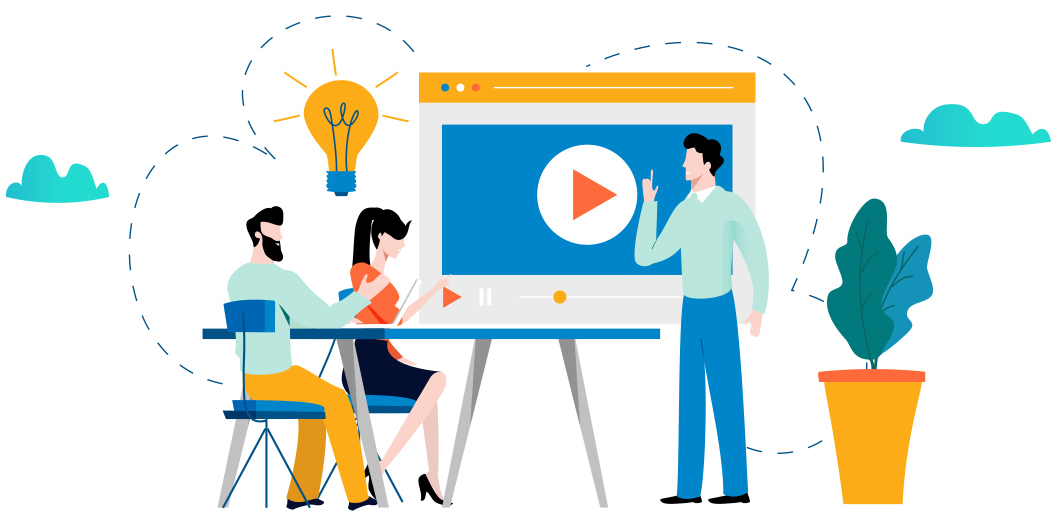
Demonstration
Example of a full case study
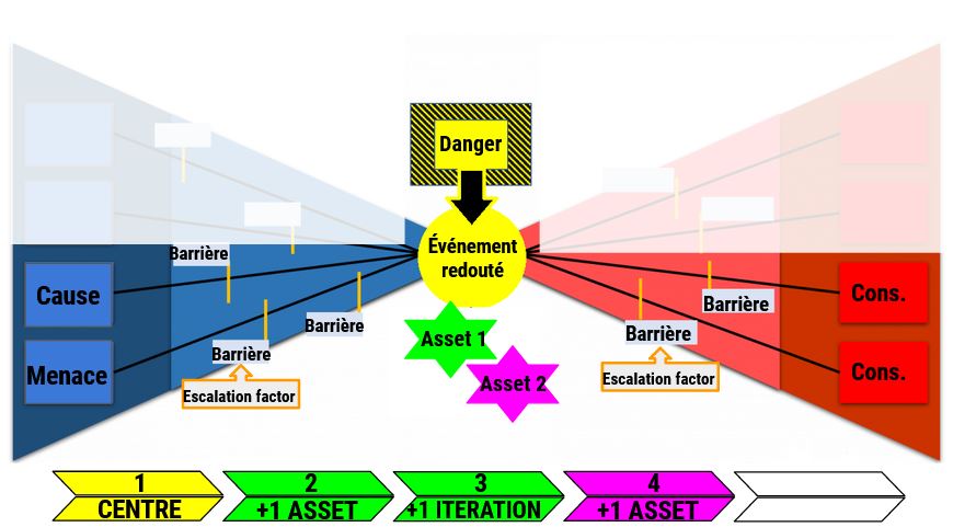
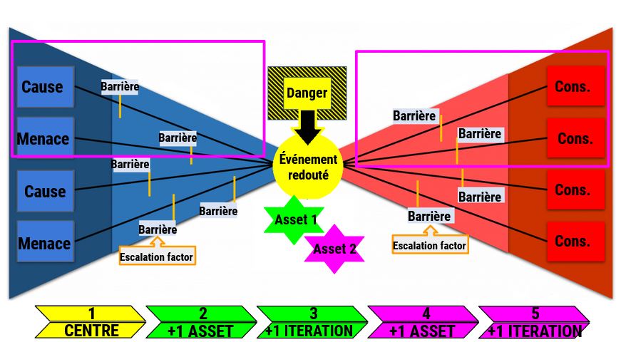
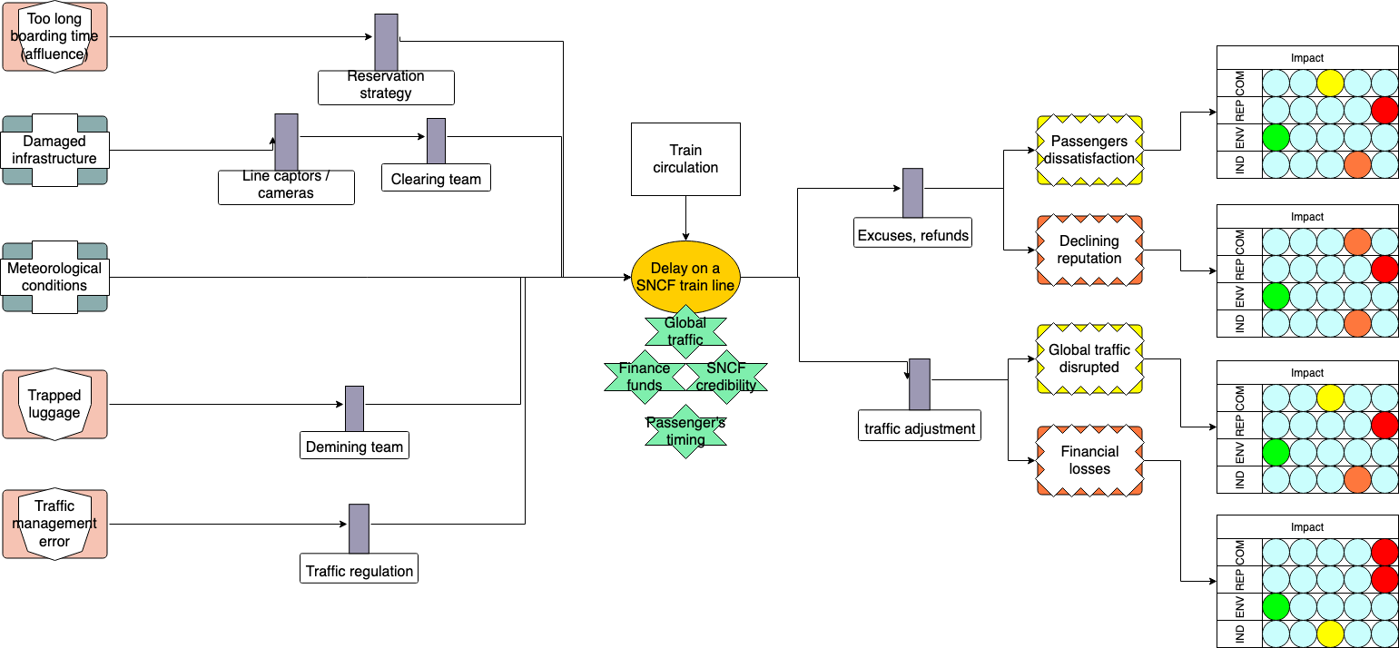
The following diagram is an example of a case study we have conducted. The hazard depicted is the circulation of trains. According to a recent study, trains in France are increasingly late and that is due to several reasons. The Bowtie diagram helps gathering the different causes, threats and consequences related to our unwanted event (the delay of trains on SNCF lines). Moreover, the user can add barriers to either prevent the occurrence of a cause, threat, consequence or limit its impact. The user can also fill in the likelihood and impact matrices related. The Bowtie diagram helps gather the different causes, threats and consequences related to our unwanted event (the delay of trains on SNCF lines). Moreover, the user can add barriers to either prevent the occurrence of a cause/threat/consequence or limit its impact. The user can also fill in the corresponding likelihood and impact matrices.
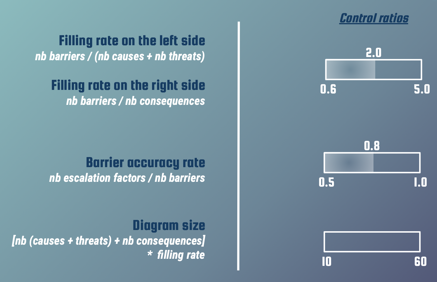
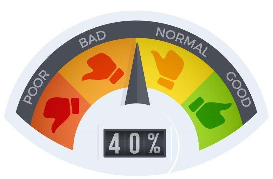
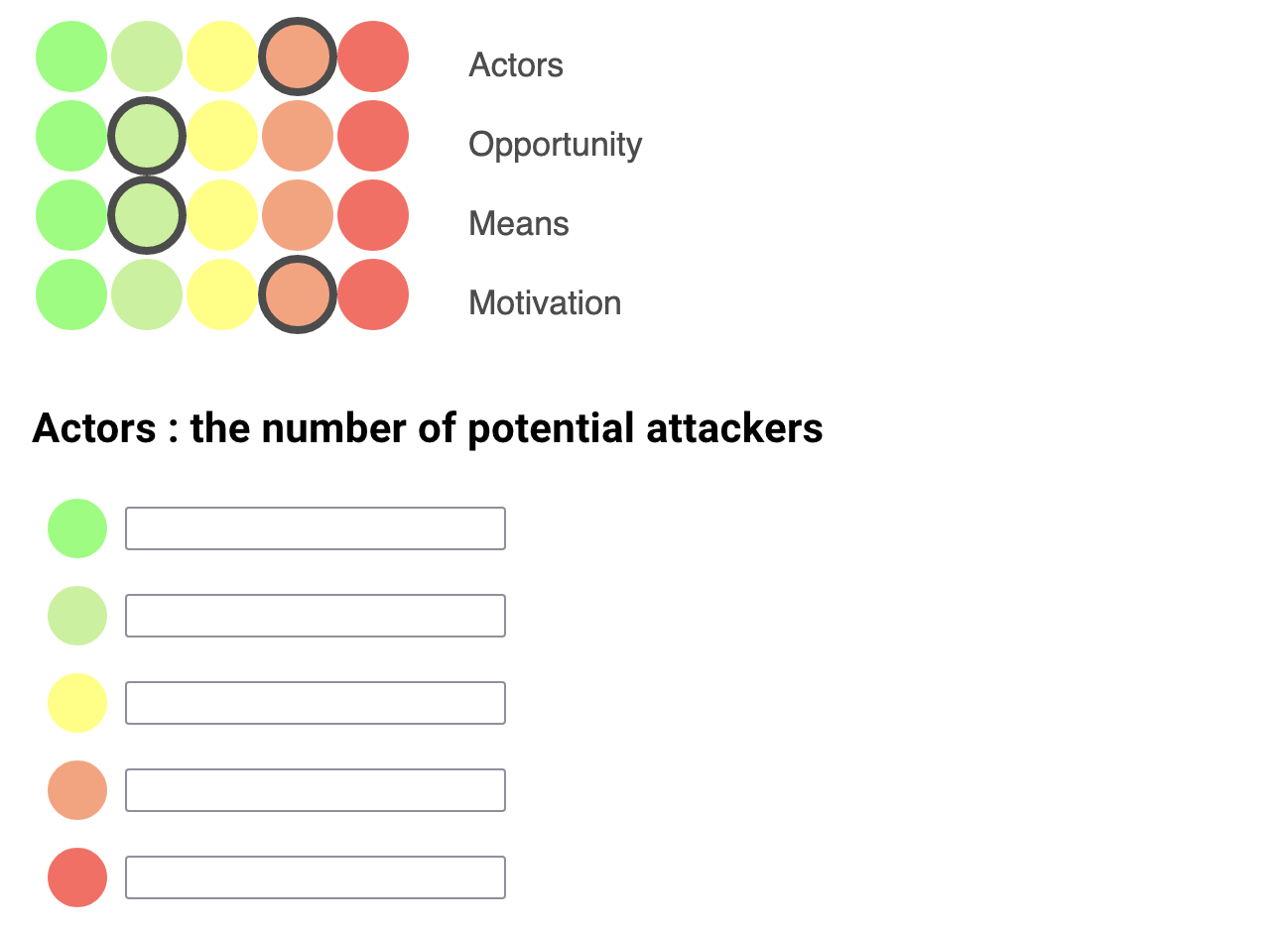
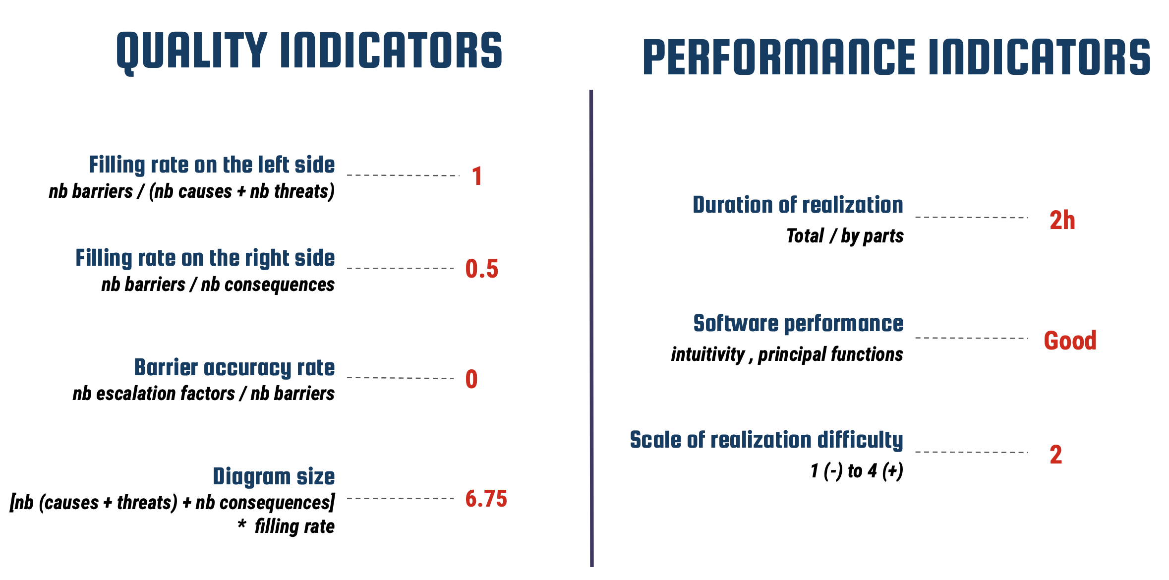
We have defined quality and performance indicators in order to evaluate Bowtie diagrams. These are numerical values allowing us to evaluate the quality of the diagrams. In the example above, we can clearly see that there isn't enough barriers on the right part of the diagram to be exhaustive with this analysis. Using our evaluation strategy, we can decide that a diagram is correct if only the filling rate on the right side is greater than or equal to 0.5. The purpose of the introduced indicators is to be able to confidently assert that a diagram is optimal.
Our team

Ronan Gabriel
Project manager

Timothée Mathieu
Communication manager

Simon Molz
Project spokesman

Manal Bouazzaoui
Case studies manager

Julie Ayoubi
Reports manager

Morgan Guillermou
Security manager

Arthur Pautrel
Management project leader
Barbara Fila
Daily supervisor
-
Researcher at IRISA
Per Håkon Meland
Project initiator
-
Researcher at SINTEF Digital